
App Icon Design Tips and Practices
Your app icon is often the first interaction users have with your app. In many cases, it determines whether someone taps to learn more or scrolls past. Because app stores are visual and competitive, a well-designed icon can significantly improve click-through rates and installs, while a weak icon can limit discoverability regardless of how strong the app itself is. At ASOWin, we view app icons as a core ASO lever. Icon design is not just about aesthetics; it directly influences visibility, conversion, and brand recognition.
Key Takeaways
- App icons have a direct impact on click-through rate and installs.
- The best icons communicate one clear idea at any size.
- Color choice and contrast strongly affect visibility.
- Consistency with your app's UI and brand builds trust.
- Text should generally be avoided.
- Logos work best only for well-known brands.
- Seasonal updates and localization can improve engagement.
- A/B testing icon variations drives measurable gains.
Why App Icons Matter
Your app icon appears everywhere — in search results, category rankings, recommendations, ads, and on the user's home screen. Because users scroll quickly, your icon must communicate value instantly. If it fails to stand out or feels confusing, users may never reach your store page. In competitive categories, even small improvements in click-through rate can lead to meaningful growth in installs. This makes icon design one of the highest-impact creative elements in ASO.
Core Principles of Effective App Icon Design
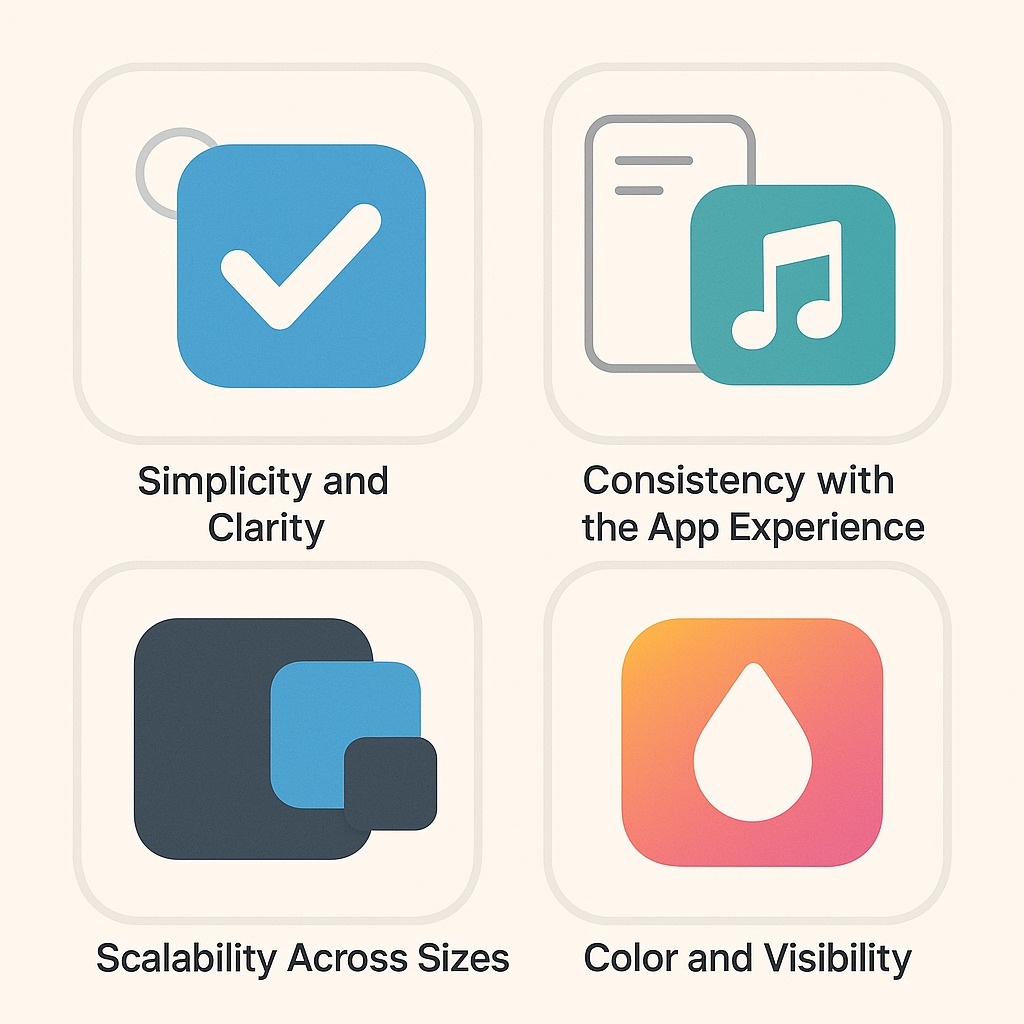
1. Simplicity and Clarity
Strong app icons focus on a single idea. Simple designs are easier to recognize, easier to remember, and perform better at small sizes. Avoid overcrowding your icon with multiple symbols, fine details, or complex scenes. If the icon does not clearly communicate its idea at small sizes, it is too complex.
2. Consistency with the App Experience
Your icon sets expectations. It should visually align with your app's tone, interface style, and audience. If your app experience is calm and minimal, an overly loud icon can feel misleading. If your app is playful, an overly corporate icon may reduce appeal. Consistency builds trust and improves retention.
3. Scalability Across Sizes
Icons must work at multiple resolutions — from large store graphics to tiny notification icons. Thin lines, small text, and intricate details often disappear at smaller sizes. Always design with small displays in mind and test across different resolutions early.
4. Color and Visibility
Color is one of the fastest ways users recognize and differentiate apps. Choose colors that align with your brand and category. Some categories favor reliable, trust-based palettes; others emphasize energy or creativity. Analyzing competitor color usage helps you decide whether to blend in or stand out. Contrast is equally important. Your icon should stay legible in both light and dark mode and remain clear against different backgrounds. Strong separation between foreground and background elements enhances recognition.
App Icon Design Best Practices
- Keep the icon simple. Focus on one symbol or concept. Icons that try to communicate too much tend to confuse users.
- Make the purpose clear. Users should understand what your app does simply by looking at the icon, especially in search results.
- Match audience expectations. Your icon should represent the experience users will find inside the app. A mismatch between icon and content hurts trust.
- Use brand colors intentionally. Limit your palette to one or two dominant colors. Too many colors reduce clarity and memorability.
- Avoid text. Text rarely scales well and can create localization issues. The app name already provides necessary context.
- Use logos carefully. Logos perform best when the brand is already recognizable. Otherwise, choose metaphors or symbols that show value clearly.
- Refresh for seasonality when relevant. Small seasonal updates can signal activity and boost engagement. Keep them subtle to maintain recognition.
- Localize for priority markets. Visual preferences differ by region. Testing localized icon variants can improve conversion internationally.
- Study competitors and differentiate. Review top apps in your category, identify visual patterns, then purposefully stand out from them.
- Test icon variations. Run A/B tests to evaluate performance. Even minor visual changes can have measurable effects.
Platform Considerations
Each platform enforces different icon guidelines. iOS automatically applies rounded corners and displays icons in multiple contexts. Google Play requires full-bleed icons without added shadows or rounded edges. Always follow official platform requirements to ensure proper rendering and avoid rejection.
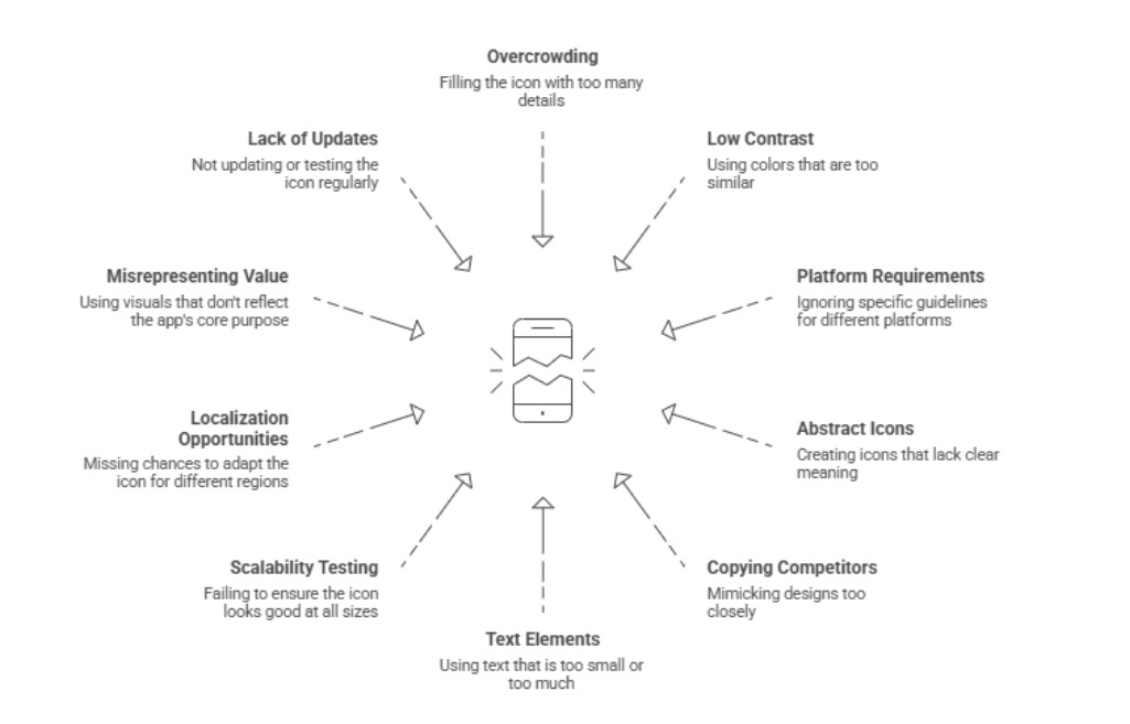
Mistakes in App Icon Design
Common mistakes include overcomplicating the design, using text that becomes illegible at small sizes, ignoring platform-specific requirements, creating icons that do not reflect the app experience, and failing to test variations. Avoiding these pitfalls requires discipline and a focus on clarity over creativity.
Testing and Iteration
Icon design is not a one-time effort. Continuous testing, iteration, and review are vital. Test one variable at a time to isolate what drives results. Combine user feedback, store analytics, and internal team reviews to make informed creative updates. Event-based or seasonal refreshes can boost engagement when executed carefully. Always treat updates as enhancements, not overhauls, to preserve user recognition.
Conclusion
Your app icon is a powerful visual asset within your ASO strategy. It determines whether users notice, tap, and ultimately install your app. Design with clear intent, focus on strong visibility, and test consistently. Incremental design improvements often yield measurable, long-term growth. At ASOWin, we help teams convert creative design choices into quantifiable ASO success through research-informed optimization and continuous experimentation.